| tags:correlation rank eigendecomposition biplot categories:methodology
multidimensional scaling of variables, and rank correlations
A fundamental idea in biplot methodology is the conference of inertia, a phrase i picked up from an SO answer by ttnphns and quickly incorporated into ordr. The basic idea arises from the central properties of a biplot, illustrated here for principal components analysis: A case–variable data matrix \(X\in\mathbb{R}^{n\times m}\) of ratio variables1 is singular-value decomposed as \(X=UDV^\top\), for example the mtcars data set:
x <- scale(mtcars, center = TRUE, scale = TRUE)
s <- svd(x)
r <- length(s$d)
Under this convention, \(U\in\mathbb{R}^{n\times r}\) and \(V\in\mathbb{R}^{m\times r}\) arise from eigendecompositions of \(XX^\top\) and of \(X^\top X\), respectively, and \(D\in\mathbb{R}^{r\times r}\) is the diagonal matrix of the square roots of their (common) eigenvalues. The matrix factors may be biplotted in three conventional ways:
- with principal case coordinates \(UD\) and standardized variable coordinates \(V\);
- with standardized case coordinates \(U\) and principal variable coordinates \(VD\);
- with symmetric case and variable coordinates \(UD^{1/2}\) and \(VD^{1/2}\).
Because both sets of eigenvectors \(U=\left[\,u_1\,\cdots\,u_r\,\right]\) and \(V=\left[\,v_1\,\cdots\,v_r\,\right]\) are orthonormal, \(U^\top U=I_r=V^\top V\) and the total inertia (variance) in each matrix is \(\sum_{j=1}^{r}{ {v_j}^2 }=r=\sum_{j=1}^{r}{ {v_j}^2 }\). Meanwhile, \(D\) contains all of the inertia of \(X\):
# inertia of the (scaled) data
sum(x^2)
## [1] 341# inertia of the case and variable factors
sum(s$u^2)## [1] 11sum(s$v^2)## [1] 11# inertia of the diagonal factor
sum(s$d^2)## [1] 341This inertia can then be conferred unto the standardized case or variable coordinates, transforming one or the other into principal coordinates (the first two options above) or both halfway there (the symmetric option). Each of these options confers the inertia in such a way that the sums of the exponents of \(D\) in the transformed sets of case (\(F=UD^p\)) and variable (\(G=VD^q\)) coordinates is \(p+q=1\), which ensures the inner product property \(FG^\top=X\) between them. This recovers any entry \(x_{ij}\) of \(X\) as the inner product \(f_i\cdot g_i\) of its case and variable coordinates \(f_i=[\,f_{i,1}\,\cdots\,f_{i,r}\,]\) and \(g_i=[\,g_{i,1}\,\cdots\,g_{i,r}\,]\).
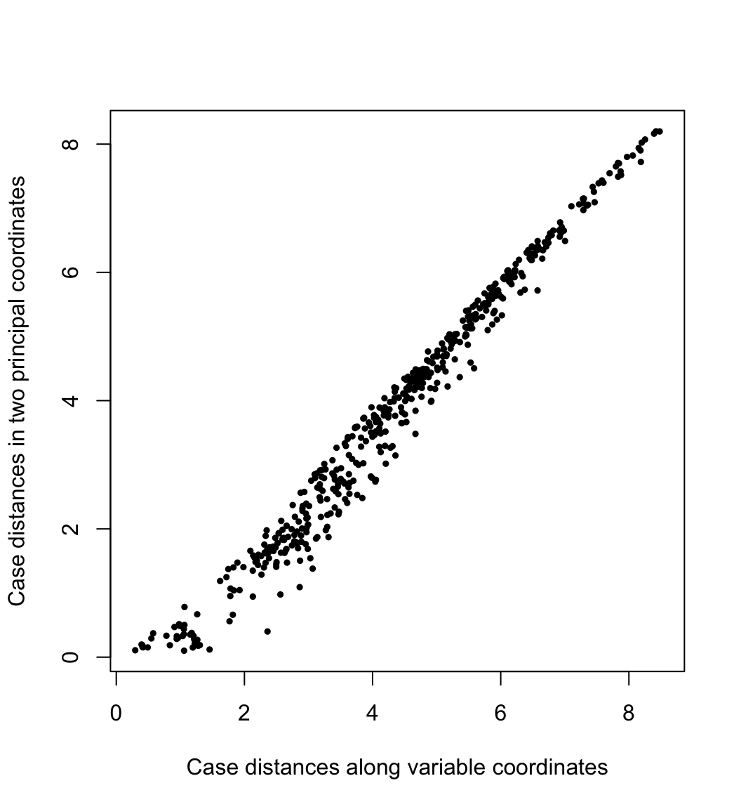
By conferring the inertia entirely to the cases or to the variables, we preserve (or best approximate) the geometric configurations of the cases or of the variables. In PCA, the geometry of the cases is usually construed as the distances between them. Here their pairwise distances \(\sqrt{(f_{j,1}-f_{i,1})^2+(f_{j,2}-f_{i,2})^2}\) in the first two PCA dimensions are plotted against their “true” distances \(\left(\sum_{k=1}^{m}{(x_{j,k}-x_{i,k})^2}\right)^{1/2}\) in the variable space:
# distances between cases
x.dist <- dist(x)
# distances between cases (principal coordinates)
s.dist <- dist(s$u[, 1:2] %*% diag(s$d[1:2]))
# scatterplot
plot(
  x = as.vector(x.dist), y = as.vector(s.dist),
  asp = 1, pch = 19, cex = .5,
  xlab = "Case distances along variable coordinates",
  ylab = "Case distances in two principal coordinates"
)
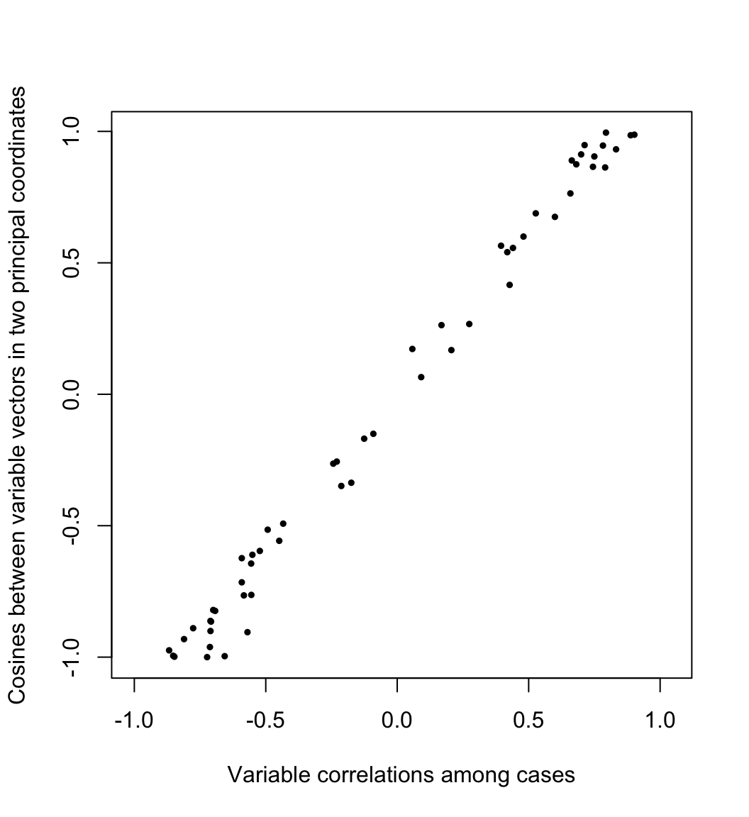
Meanwhile, the geometry of the variables is usually understood through their covariances or correlations. Writing \(X=[\,y_1\,\cdots\,y_m\,]\) as an array of column variables, the covariance between \(y_i\) and \(y_j\) is proportional to their inner product \[\textstyle \operatorname{cov}(y_i,y_j)=\frac{1}{n}y_i\cdot y_j=\frac{1}{n}\lVert y_i\rVert\lVert y_j\rVert\cos\theta_{ij}\text,\] so that the cosine of the angle \(\theta_{ij}\) between them equals their correlation: \[\cos\theta_{ij}=\frac{\operatorname{cov}(y_i,y_j)}{\sqrt{\operatorname{cov}(y_i,y_i)\operatorname{cov}(y_j,y_j)}/n}=\frac{\operatorname{cov}(y_i,y_j)}{\sigma_i\sigma_j}=r_{ij}\] Here the cosines \(\frac{g_i}{\lVert g_i\rVert}\cdot\frac{g_j}{\lVert g_j\rVert}\) between the variable vectors in the first two PCA dimensions are plotted against their correlations \(r_{ij}\) across the original cases:
# correlations between variables
x.cor <- cor(x)
# magnitudes of variable vectors
s.len <- apply(s$v[, 1:2] %*% diag(s$d[1:2]), 1, norm, "2")
# cosines between variables (principal coordinates)
s.cor <- (s$v[, 1:2] / s.len) %*% diag(s$d[1:2]^2) %*% t(s$v[, 1:2] / s.len)
# scatterplot
plot(
  x = as.vector(x.cor[lower.tri(x.cor)]),
  y = as.vector(s.cor[lower.tri(s.cor)]),
  asp = 1, pch = 19, cex = .5,
  xlab = "Variable correlations among cases",
  ylab = "Cosines between variable vectors in two principal coordinates"
)
multidimensional scaling of variables
The faithful approximation of inter-case distances by principal coordinates is the idea behind (classical) multidimensional scaling (MDS), which can be applied to a data set of distances \(\delta_{ij},\ 1\leq i,j\leq n\) in the absence of coordinates. This technique is based on the eigendecomposition of a doubly-centered matrix of squared distances, which produces matrix \(U\Lambda^{1/2}\) whose first \(r\) coordinates—for any \(r\leq n\)—recover a best approximation of the inter-case distances in terms of the sum of squared errors, i.e. the variance of \((U\Lambda^{1/2})(U\Lambda^{1/2})^\top-\Delta=U\Lambda U^\top-\Delta\), where \(\Delta=(\delta_{ij})\in\mathbb{R}^{n\times n}\). In practice, the goal is usually to position points representing the \(n\) cases in a 2-dimensional scatterplot so that their distances \(\sqrt{(x_j-x_i)^2+(y_j-y_i)^2}\) approximate their original distances \(\delta_{ij}\), as in this example using road distances between U.S. cities to approximate their geographic arrangement:
d <- as.matrix(UScitiesD)
cent <- diag(1, nrow(d)) - matrix(1/nrow(d), nrow(d), nrow(d))
d.cent <- -.5 * cent %*% (d^2) %*% cent
d.mds <- svd(d.cent)
d.coord <- d.mds$u[, 1:2] %*% diag(sqrt(d.mds$d[1:2]))
plot(d.coord, pch = NA, asp = 1, xlab = "", ylab = "")
text(d.coord, labels = rownames(d))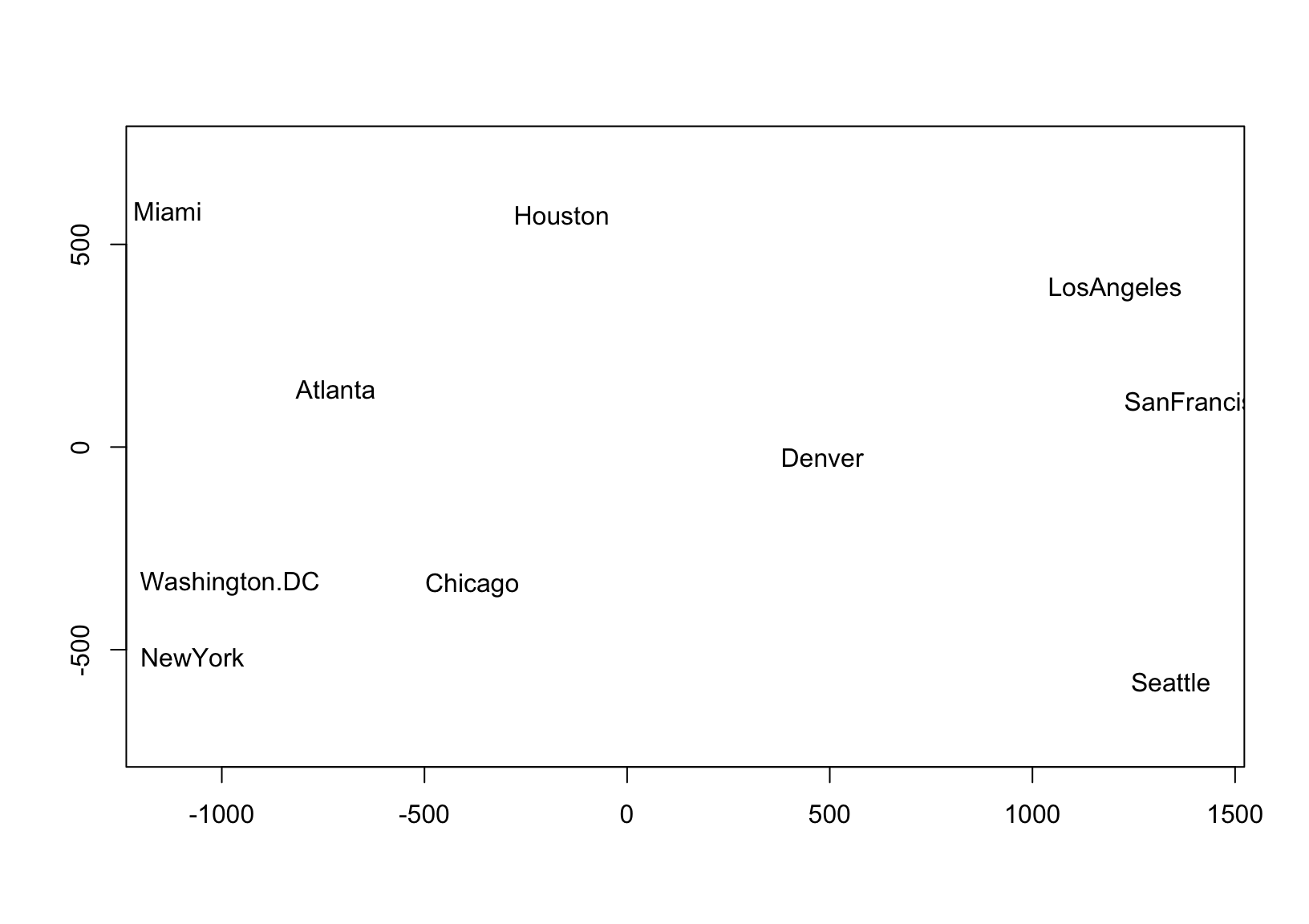
The faithful approximation of inter-variable covariances by the inner products of their principal coordinate vectors suggests a complementary technique that i haven’t found explicitly discussed in my own background reading. Suppose we have data that consist not of distances between cases but of covariances \(\operatorname{cov}(y_i,y_j),\ 1\leq i,j\leq m\) between variables. Again the data are coordinate-free, so PCA cannot be applied. Were the data to have derived from a centered case–variable matrix \(X\), then the covariance matrix \(C=(\operatorname{cov}(y_i,y_j))\) would have been obtained as \(C=\frac{1}{n}X^\top X\), which is (up to scalar) the matrix whose eigenvectors would be given by \(V\) in the SVD \(X=UDV^\top\). Therefore, we can fabricate coordinates for the \(m\) variables that approximate what we know of their geometry—in this case, thinking of the variables as unknown vectors, whose magnitudes and pairwise angles are encoded in \(C\)—via an eigendecomposition \(C=V\Lambda V^\top\): Take \(Y=V\Lambda^{1/2}\in\mathbb{R}^{m\times r}\), so that \(Y^\top Y\approx C\).
I’ll validate this line of reasoning by taking the mtcars data set for a spin:
# covariances and standard deviations
c <- cov(mtcars)
s <- diag(sqrt(diag(c)))
# centered data
x <- as.matrix(scale(mtcars, center = TRUE, scale = FALSE))
# eigendecomposition of covariance matrix
c.eigen <- eigen(c)
# artificial coordinates
c.coord <- c.eigen$vectors %*% diag(sqrt(c.eigen$values))
# validate covariance recovery (up to sign)
all.equal(
  as.vector(c.coord %*% t(c.coord)),
  as.vector(c),
  tolerance = 1e-12
)
## [1] TRUEThus, whereas MDS of cases is used to represent distances, MDS of variables can be used to represent covariances. A use case for this technique is a situation in which covariance data exist without variable values. This may of course be the case because original data has become unavailable.
A more interesting setting that gives rise to this situation is the analysis of multiple rankings of the same set of objects in terms of their concordance. Rankings’ concordance is often measured using rank correlations such as Kendall’s \(\tau\), which may be general correlation coefficients in the sense proposed by Kendall but are not associated with an underlying (Euclidean) geometry. Nevertheless, we can use MDS to represent these rankings as unit vectors in Euclidean space whose pairwise cosines approximate their rank correlations!
example: rankings of universities
A real-world example is provided by the Quacquarelli Symonds Top University Rankings, which include rankings of hundreds of world universities on six “metrics”: academic reputation, employer reputation, faculty–student ratio, citations per faculty, international faculty ratio, and international student ratio. QS weight these rankings differently in their overall assessment, but our analysis will compare the rankings to each other, so these weights are irrelevant. I restricted the data from the year 2020 to universities in the United States for which integer rankings (i.e. not “400+” placeholders) were available in all four years:2
qswurus20 <- readRDS(here::here("supplementary/qswurus20.rds"))
head(qswurus20)
## year institution size focus res age
## 1 2020 MASSACHUSETTS INSTITUTE OF TECHNOLOGY (MIT) M CO VH 5
## 2 2020 STANFORD UNIVERSITY L FC VH 5
## 3 2020 HARVARD UNIVERSITY L FC VH 5
## 4 2020 CALIFORNIA INSTITUTE OF TECHNOLOGY (CALTECH) S CO VH 5
## 5 2020 UNIVERSITY OF CHICAGO L FC VH 5
## 6 2020 PRINCETON UNIVERSITY M CO VH 5
## status rk_academic rk_employer rk_ratio rk_citations rk_intl_faculty
## 1 B 5 4 15 7 43
## 2 B 4 5 12 13 62
## 3 B 1 1 40 8 186
## 4 B 23 74 4 4 72
## 5 B 13 37 54 60 249
## 6 B 10 19 192 3 272
## rk_intl_students
## 1 87
## 2 196
## 3 221
## 4 121
## 5 143
## 6 197Since the integer rankings were subsetted from the full international data set, they are not contiguous (i.e. some integers between rankings never appear). To resolve this, i’ll recalibrate the rankings by matching each vector of ranks to the vector of its sorted unique values:
library(dplyr)
qswurus20 %>%
  select(institution, starts_with("rk_")) %>%
  mutate_at(
    vars(starts_with("rk_")),
    ~ match(., sort(unique(as.numeric(.))))
  ) %>%
  print() -> qswurus20
## # A tibble: 38 x 7
## institution rk_academic rk_employer rk_ratio rk_citations
## <chr> <int> <int> <int> <int>
## 1 MASSACHUSE… 3 2 6 3
## 2 STANFORD U… 2 3 4 5
## 3 HARVARD UN… 1 1 11 4
## 4 CALIFORNIA… 12 14 1 2
## 5 UNIVERSITY… 9 11 13 12
## 6 PRINCETON … 7 7 18 1
## 7 CORNELL UN… 11 13 22 7
## 8 UNIVERSITY… 14 12 8 17
## 9 YALE UNIVE… 6 4 2 24
## 10 COLUMBIA U… 8 8 7 25
## # … with 28 more rows, and 2 more variables: rk_intl_faculty <int>,
## # rk_intl_students <int>This subset of universities is now contiguously ranked along the six dimensions described above. The Kendall correlation \(\tau_{ij}\) between two rankings measures their concordance. To calculate it, every pair of universities contributes either \(+1\) or \(-1\) according as the rankings \(i\) and \(j\) place that pair in the same order, and the sum is scaled down by the number of pairs \({n\choose 2}\) so that the result lies between \(-1\) and \(1\). We interpret \(\tau_{ij}=1\) as perfect concordance (the rankings are equivalent), \(\tau_{ij}=-1\) as perfect discordance (the rankings are reversed), and \(\tau_{ij}=0\) as independence (the rankings are unrelated).
The QS rankings are not variations on a theme, like different measures of guideline adherence or positive affect, but they do all seem potentially sensitive to a university’s resources, including funding and prestige. I intuit that the two reputational metrics should be positively correlated, and that the two international ratios should be as well. I also wonder if the faculty–student ratio might be anti-correlated with the number of citations per faculty, separating more research-focused institutions from more teaching-focused ones.
correlation heatmap
A common way to visualize correlation matrices is the heatmap, so i’ll use that technique first (see below). While the rankings by academic and employer reputations are highly concordant, those by international faculty and student ratios are less so; and, the faculty–student ratio and faculty citation rankings have the weakest concordance of all, but are nevertheless positively correlated.
c <- cor(select(qswurus20, starts_with("rk_")), method = "kendall")
corrplot::corrplot(c)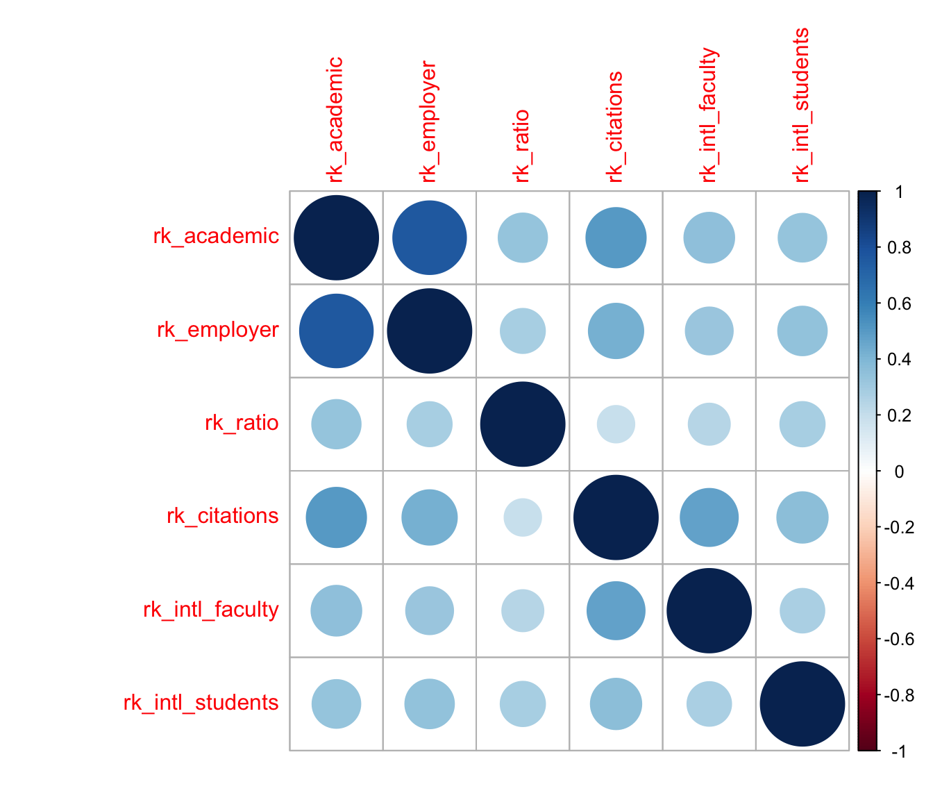
This visualization is useful, but it’s very busy: To compare any pair of rankings, i have to find the cell in the grid corresponding to that pair and refer back to the color scale to assess its meaning. I can’t rely on the nearby cells for context, because they may be stronger or weaker than average and skew my interpretation. For example, the visibly weak associations between the faculty–student ratio and other rankings (the third row or column) happen to be arranged so that the slightly stronger among them, with the two reputational variables, are sandwiched between the even stronger associations between the two reputational rankings and between them and the faculty citations ranking; whereas its weaker associations are sandwiched between more typical, but still comparatively stronger, associations. A different ordering of the variables might “obscure” this pattern and “reveal” others.
The plot is also strictly pairwise: Every correlation between two rankings occupies its own cell—two, in fact, making almost half of the plot duplicative. This means that a subset analysis of, say, three rankings requires focusing on three cells at the corners of a right triangle while ignoring all the surrounding cells. This is not an easy visual task. It would be straightforward to create a new plot for any subset, but then the larger context of the remaining rankings would be lost.
correlation biplot
MDS of variables offers a natural alternative visualization: the biplot. As with MDS of cases, the point isn’t to overlay the case scores and variable loadings from a singular value decomposition, but to use the scores or loadings alone to endow the cases or variables with a Euclidean geometry they didn’t yet have. To that end, i’ll plot the variables as vectors with tails at the origin and heads at their fabricated coordinates \(Y=V\Lambda^{1/2}\):
c.eigen <- eigen(c)
c.coord <- c.eigen$vectors %*% diag(sqrt(c.eigen$values))
plot(c.coord, pch = NA, asp = 1, xlab = "", ylab = "")
arrows(0, 0, c.coord[, 1], c.coord[, 2])
text(c.coord, labels = rownames(c))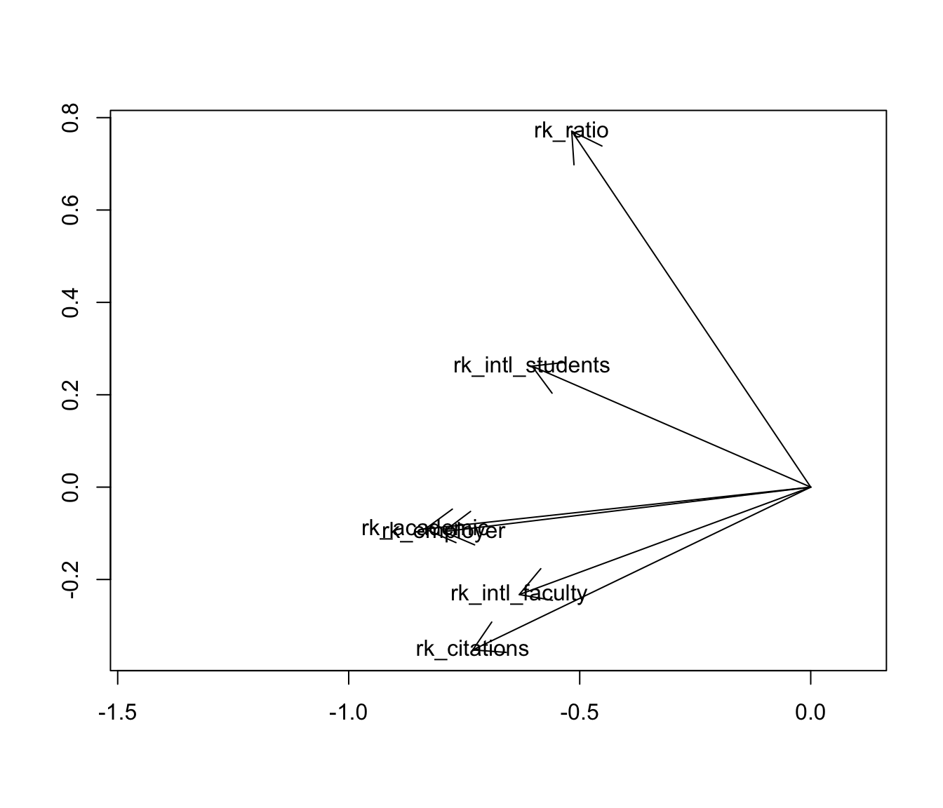
A more elegant ggplot2-style graphic can be rendered with ordr, with a unit circle included for reference:
library(ordr)
eigen_ord(c) %>%
  as_tbl_ord() %>%
  augment() %>%
  mutate_u(metric = stringr::str_remove(.name, "rk_")) %>%
  confer_inertia(1) %>%
  negate_to_nonneg_orthant("u") ->
  c_eigen
c_eigen %>%
  ggbiplot() +
  theme_minimal() +
  geom_unit_circle() +
  geom_u_vector() +
  geom_u_text_radiate(aes(label = metric)) +
  scale_x_continuous(expand = expand_scale(add = .4)) +
  scale_y_continuous(expand = expand_scale(add = .2)) +
  ggtitle("MDS of Kendall correlations between university rankings")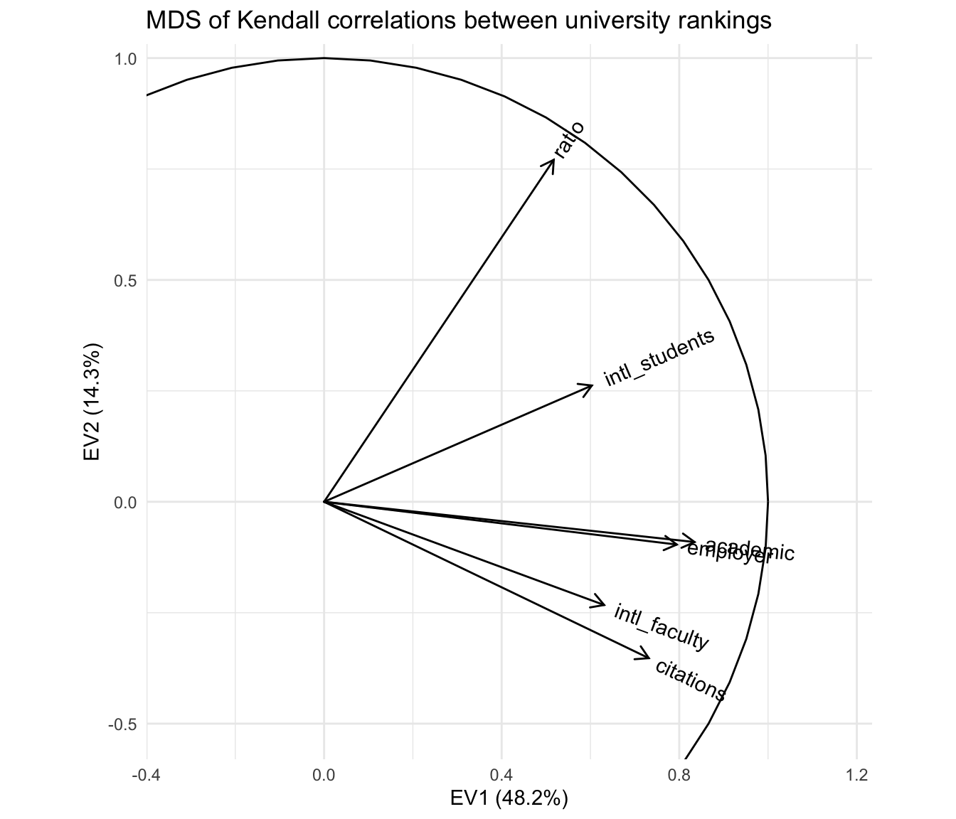
With respect to the pairwise correlations, the biplot is significantly less precise: Though the vectors all have unit length in \(\mathbb{R}^r\) (\(r\leq m=6\)), their projections onto the first two principal coordinates are much shorter, indicating that much of the geometric configuration requires additional dimensions to represent. Indeed, these coordinates capture only \(48.2\%+14.3\%=62.5\%\) of the inertia in the full representation. This means that the angles between the vectors must be interpreted with caution: For example, it looks like the academic and employer reputation rankings are extremely correlated, but the apparent alignment of the vectors could be an artifact of the projection, when in fact they “rise” and “fall” in opposite directions along the remaining dimensions. The correlation heatmap leaves no such ambiguity.
However, the biplot far surpasses the heatmap at parsimony: Each variable is represented by a single vector, and the angle cosines between the variable vectors roughly approximate their correlations. For instance, the rankings based on international student and faculty ratios have correlation around \(\cos(\frac{\pi}{4})=\frac{1}{\sqrt{2}}\), corresponding to either explaining half the “variance” in the other—not technically meaningful in the ranking context but a useful conceptual anchor. Meanwhile, the faculty–student ratio ranking is nearly independent of the faculty citation ranking, contrary to my intuition that these rankings would reflect a reverse association between research- and teaching-oriented institutions. The convenience of recognizing correlations as cosines may be worth the significant risk of error, especially since that error (the residual \(37.5\%\) of inertia) can be exactly quantified.
Moreover, the principal coordinates of the variable vectors indicate their loadings onto the first and second principal moments of inertia—the two dimensions that capture the most variation in the data. For example, the first principal coordinate is most aligned with the two reputational rankings, suggesting that a general prestige ranking is the strongest overall component of the several specific rankings. In contrast, the faculty–student ratio and faculty citation rankings load most strongly onto the second principal coordinate, suggesting that the divide between research- and teaching-focused institutions may yet be important to understanding how universities compare along these different metrics. These observations, provisional though they are, would be difficult to discern from the heatmap. More importantly, unlike the secondary patterns visible in the heatmap, these are in no sense artifacts of the layout but arise directly from the (correlational) data.
This last point means that observations made from a biplot can be validated from the MDS coordinates. In particular, we can examine the variables’ loadings onto the third principal coordinate, and we can check whether the reputational rankings are aligned or misaligned along it.
c_eigen %>%
  tidy(.matrix = "u") %>%
  select(-.name, -.matrix)
## # A tibble: 6 x 7
## EV1 EV2 EV3 EV4 EV5 EV6 metric
## <dbl> <dbl> <dbl> <dbl> <dbl> <dbl> <chr>
## 1 0.834 -0.0907 -0.412 0.0430 0.0206 -0.351 academic
## 2 0.795 -0.0964 -0.477 -0.0416 0.181 0.311 employer
## 3 0.517 0.771 0.0480 0.331 -0.158 0.0372 ratio
## 4 0.731 -0.352 0.239 -0.0278 -0.528 0.0685 citations
## 5 0.631 -0.233 0.521 0.392 0.352 -0.00783 intl_faculty
## 6 0.603 0.262 0.324 -0.665 0.140 -0.0312 intl_studentsc_eigen %>%
tidy(.matrix = "coord")## # A tibble: 6 x 4
## .name .values .inertia .prop_var
## <fct> <dbl> <dbl> <dbl>
## 1 EV1 2.89 2.89 0.482
## 2 EV2 0.858 0.858 0.143
## 3 EV3 0.833 0.833 0.139
## 4 EV4 0.709 0.709 0.118
## 5 EV5 0.480 0.480 0.0799
## 6 EV6 0.227 0.227 0.0379Based on the third principal coordinates, the reputational rankings are aligned, as we knew already from the correlation matrix and heatmap. What’s a bit more interesting is that this component seems to separate these two rankings from those having to do with faculty citation rates and the international compositions of the faculty and student body. Based on the decomposition of inertia, this third principal coordinate is nearly as important as the second! It therefore makes sense to plot the two together:
c_eigen %>%
  ggbiplot(aes(x = 2, y = 3)) +
  theme_minimal() +
  geom_unit_circle() +
  geom_u_vector() +
  geom_u_text_radiate(aes(label = metric)) +
  scale_x_continuous(expand = expand_scale(add = .4)) +
  scale_y_continuous(expand = expand_scale(add = .4)) +
  ggtitle("MDS of Kendall correlations between university rankings",
          "Second and third principal coordinates")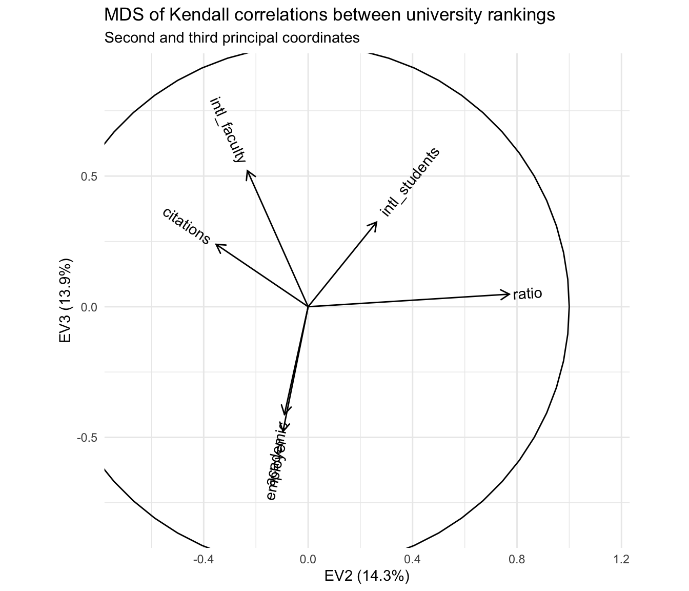
The primary antitheses of the reputational rankings, after removing the first principal coordinate, are the two rankings based on international composition—and this axis is largely independent of the axis apparently distinguishing research- from teaching-oriented institutions. From my own limited knowledge, i’d hazard a guess that this reflects two tiers of international representation among students and faculty, one expressed by the most prestigious institutions that recruit highly qualified applicants from all over the world, and the other expressed by institutions that are not especially prestigious but are located in communities or regions with high percentages of international residents.
This is of course no more than idle speculation on my part! But a visualization scheme that encourages hypothesis generation is worth having on hand.